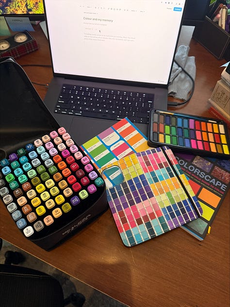
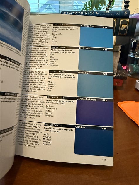
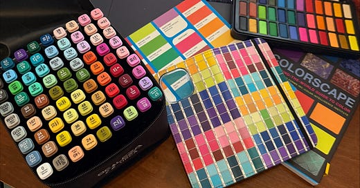
[I’m sharing a piece of rough writing from my memoir in progress, Rambles. I’m dedicating a couple of precious hours to it today, transcribing notes from my phone, emails I’ve sent myself…post it notes while on the other side of my desk I build out the content for my word of the year workshop, What’s Your Word? I’m excited to host tomorrow. I just snapped these pics on my desk.


Ding! I heard the bell and it wasn’t an angel getting their wings (as far as I know)—my workshop AND my memoir have something in common…colour and it’s significance in my life. ]
excerpt in process:
I’ve always believed that I see more colours than other people. I don’t know if I’m a tetrachromat or not but I have a very sensitive colour awareness (as I think of it) and I believe on my sentimental writing days it is connected to being a printer’s kid. My father set up his own printshop in 1963 and in the decades that followed I spent more time there than I did anywhere else, partly by choice, partly to stay out from under my mother’s feet.
I’ve had encounters with colour and my discerning feel its nuanced shades my entire life. I remember tearing pages of colours (lipsticks and nailpolishes likely) from my magazines as a teen and taping them to my door. They had names and I really liked that naming practice because my dad taught me that too.
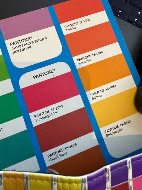
You see, my father never called something just yellow or red. At his knee I learned to fan paper that was mustard, sunflower and goldenrod and see inks become ruby, firehouse or russet red. I never knew if these names were his invention or if he pulled them from the colour deck that was a constant presence on his mixing table or desk. Pantone was a commerical printing company in the US in the 1950’s and a bright young chemist named Lawrence Herbert who worked there created a system of colour identification to simplify production. Oh, and he bought the company from the owners in the 60’s. Cool story, right.
I poured over the Pantone colour deck, and recently looked into buying myself one and saw the price…uh no. Anyone want to donate an old one, message me?!
It’s so fun to watch colours be mixed now according the RGB and HEX does in paint shops. But the computer mixing ink colours for a couple of decades of my life was my father’s eye. He would let me watch for hours, and let me help discern which colour was closest after a dollop with heat fun or blow dryer, another fun part.
My father was developing ‘brand’ colours before we called it branding. I still have his first business cards here in my desk. He was an innovative designer ahead of his time, and adored the same ‘pop of colour’ style that I do.
I remember as a young child naming my clothes and toys by the actual colour. Burgundy was not fuschia. Teal was not blue. Mauve was not purple. I admit that I was less interested in the neutrals, because Dad wasn’t printing decor for the insides of Prowler trailers in my early days.
I think colour became one of the early languages that my father and I spoke. We had so many. It showed up in textiles for me first..yarns, fabrics, threads early on. I became a knitwear designer when my children are very young and searched out custom yarn makers who twisted chunky cotton into a weight that would could be worn and treated like a sweatshirt for babies and preschoolers (called Kiddo Knits). I wanted mallard blue, bubblegum pink, cranberry red, and denim blue. I was so frustrated with the limited colour palette and I recall me not being able to create my own line of yarn being a deciding factor for me moving on.
I can remember periods of my life by the colour I was obsessed with. There was the wine years when the deepest of burgundy was my fave, then hunter green, fawn brown, and moss green got their years. It has been teal for me for a long time now. Favourite shade: a “celadon” or is it “cerulean” (haha) by a particular paint company, but it’s called many many things.
My father’s eyes, yes I have them..the crystal blue he was famous for are still with me. But I think I got his “eye”or colour acuity too. If you’re one of those people who needs things to “go together”, that’s only a taste of this of the preciseness I see. I can tell when shades of colour are different because they are on differently composed fabrics and it makes me crazy. It did my father too. “Those aren’t the same,” comes out of my mouth too often if I shop in person for towels or clothes. I had to stop shopping in person. (My VISA found another way, don’t worry.) This is exactly why I wear so much black…it is a great colour to trick the eye on different fabrics…
So many things in my world came from the time I watched my father mix ink, blend colours for logos on envelopes, brochures and business cards.
He gave me his eyes and taught me how to open them.
Any other printer’s kids out there?
Can you see, smell and hear the days of large shiny pots of base colour ink stacked above glass mixing boards, alongisde impeccably cleaned spatulas, and the deck of a Heidelberg offset press. Does that take you back to the 70’s…drop me a comment please.


Thanks for asking...the What's Your Word? word of the year live free workshop tomorrow is here: https://pattimhall.com/wyw-workshop/